Desktop and Tablet Design
Redesigning a Point of Sale Software for a Technology Manufacturer
*Please note all images are redacted as the project is under NDA
Problem:
In order to make sales and encourage customer engagement during COVID, we needed the redesign to capture attention, communicate all device features in a digestible way, and offer ways to compare devices in a simple manner. In addition, we needed to keep the customer’s safety and hygiene in mind.
Solution:
A clean UI that omits tech jargon; simplifying customer understanding with usage roles, easily accessible fact tags, and features such as compare and shortlist along with optional sales assistance. The team also added a mobile component using QR codes to the design to aid a touchless experience.
Scope:
I was brought on during the “Discovery Phase” (3 months, the entire project spans 1 year) to assist with user research and preliminary wireframes. The UX team consisted of 2 onsite and 2 offshore designers. I was responsible for the standard customer facing portion and the matching mobile designs.
Methodologies & Deliverable:
User and stakeholder research presentation, workflows, inspiration boards, low fidelity wireframes all made using Figma
Client & Goals
Our client is a well known Fortune 500 technology manufacturer. Other portions of the project include the admin portal, Chromebook version, gaming version, store/HQ account version, and matching mobile designs.
The goal was to refresh the design of the software (this is something they do every few years) while bearing in mind how shopper behavior would be impacted by COVID.
User Research
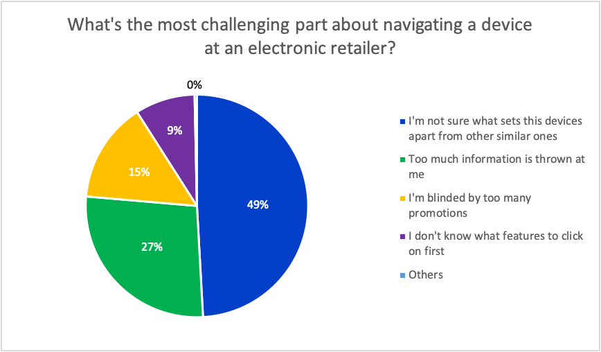
All research had to be conducted virtually as this was during the start of COVID quarantine. This was achieved through a survey detailing customer shopping behavior to learn about the user’s electronic shopping journey. We received 370 (57% male and 42% female, age range 18-46) responses on the survey from India, the US, Australia, and Europe. We tried to gain an international perspective as this would be a software used around the world. Some insights are below, the last picture depicts the order of occurrence for customer buying journey per the survey.
For this portion of the project, I helped create the survey and the graphs depicted were straight from Google Forms.
Stakeholder Workshops
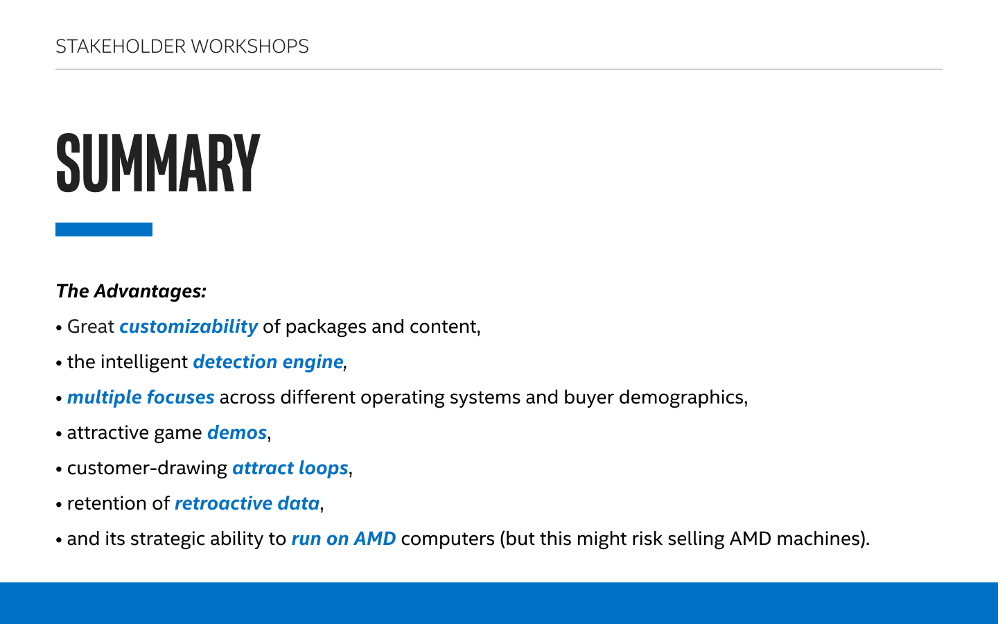
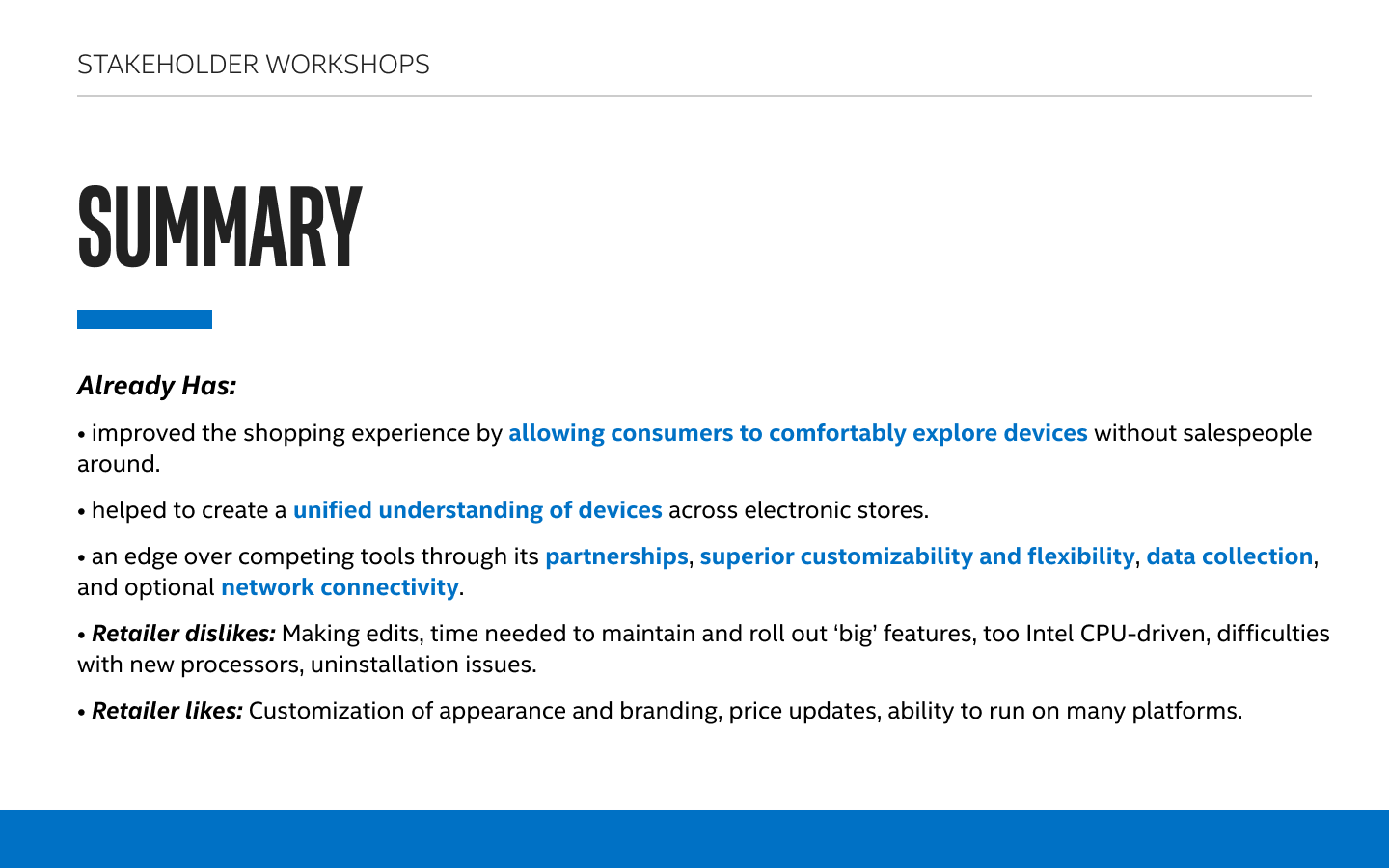
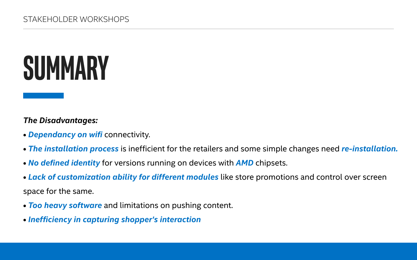
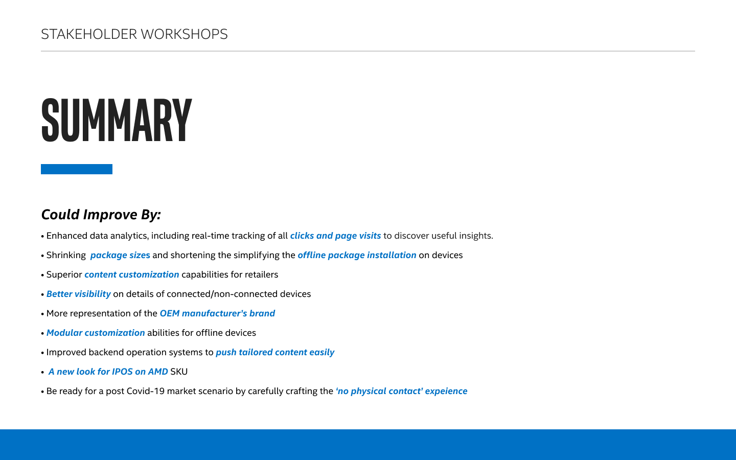
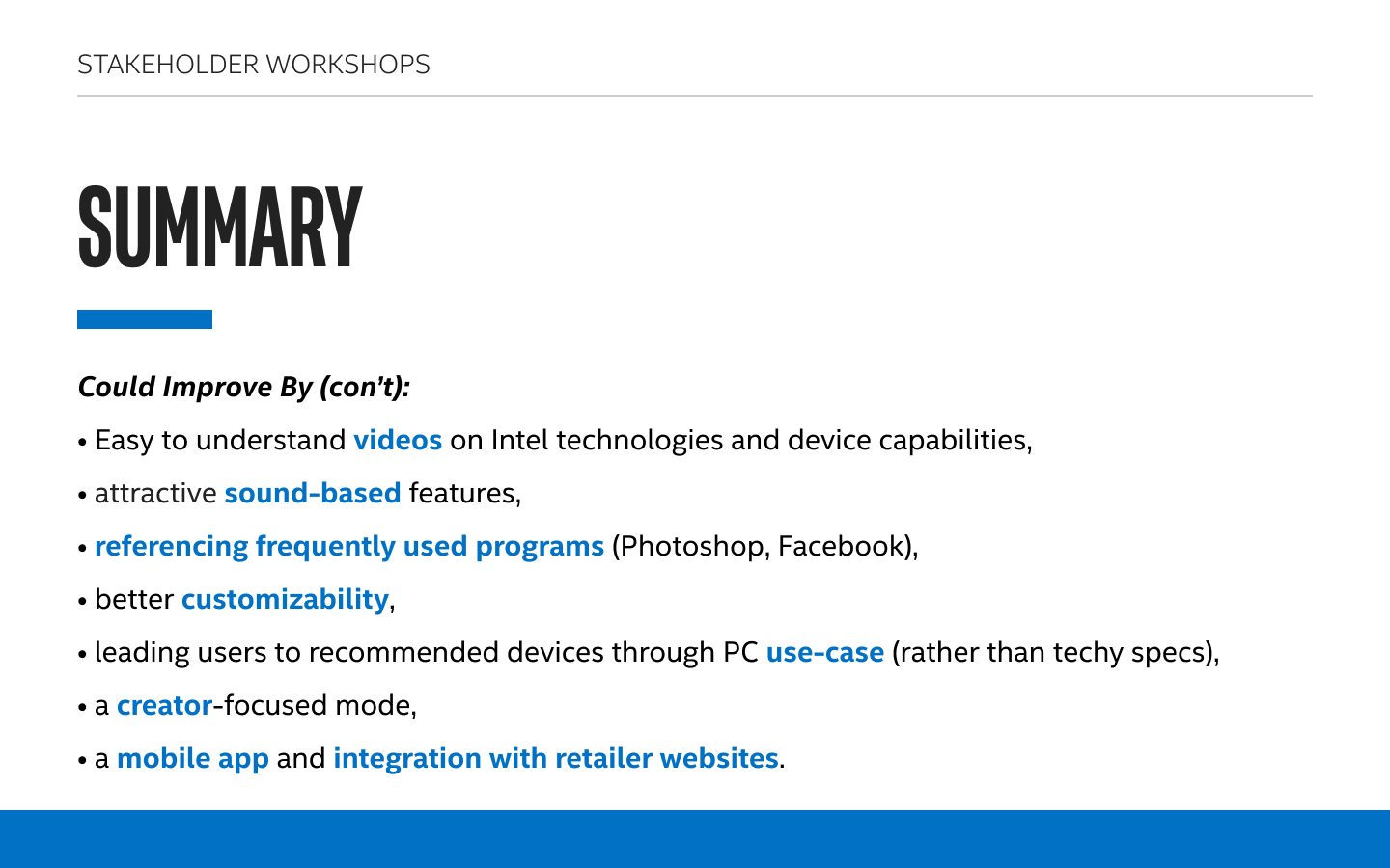
We also conducted multiple workshops with the product’s stakeholders and salespeople. There were 3 workshops total, each workshop took around 2.5 hours. Since this was during quarantine, all workshops were conducted via Figma. The two rounds of workshops were conducted with high level stakeholders, while the third round was conducted with salespeople were would be using the software. The screenshots below are a few examples of what the activities looked like on Figma.
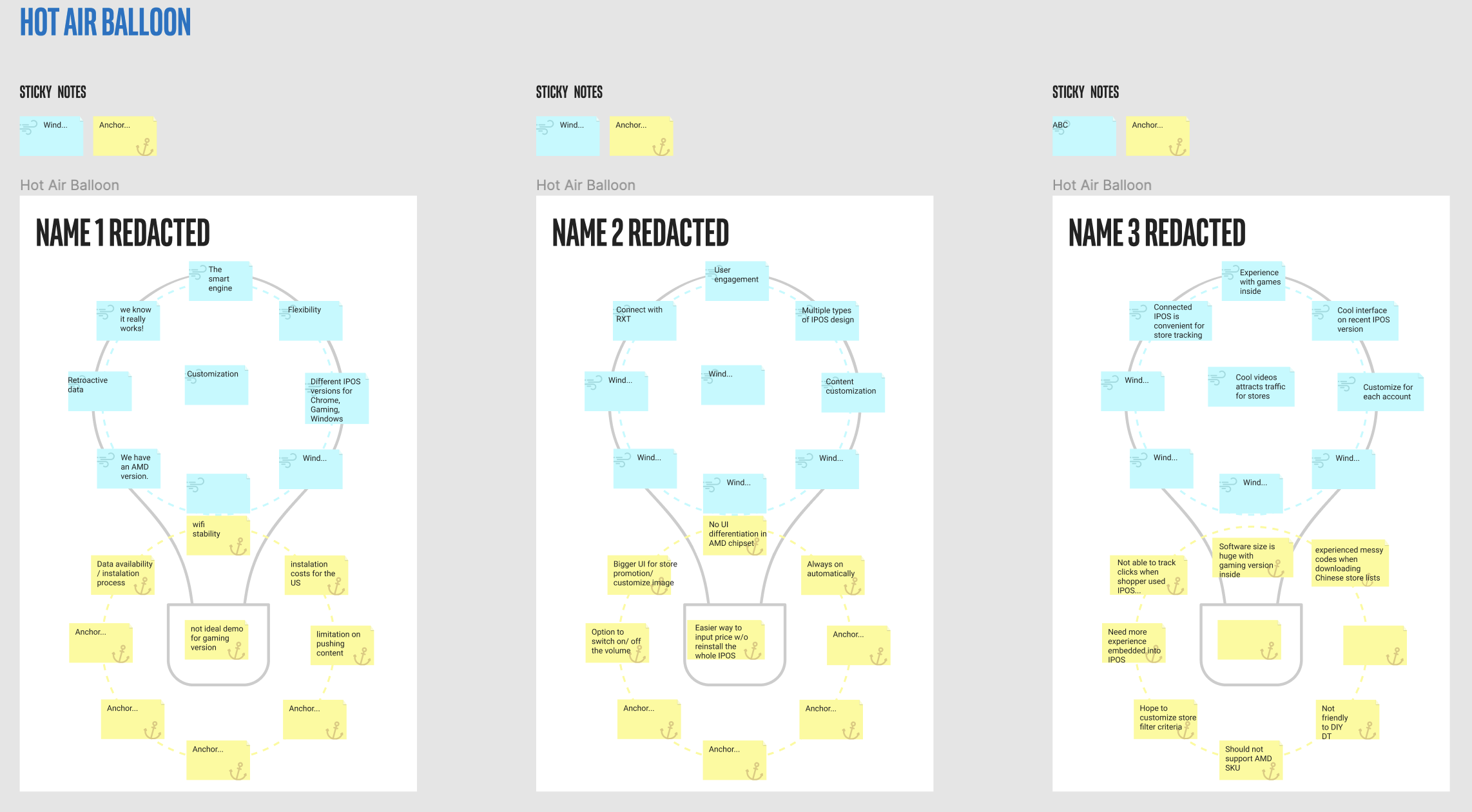
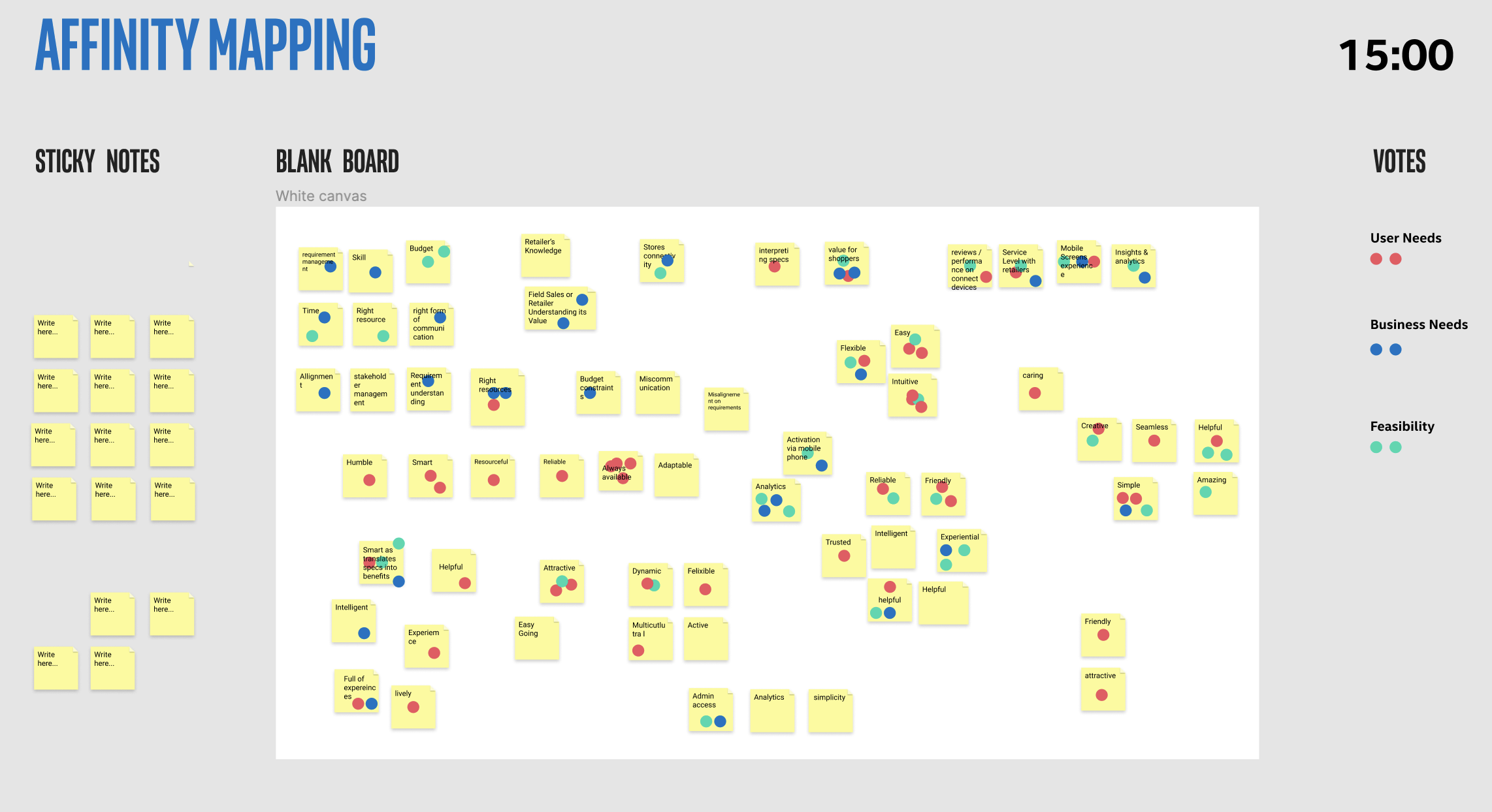
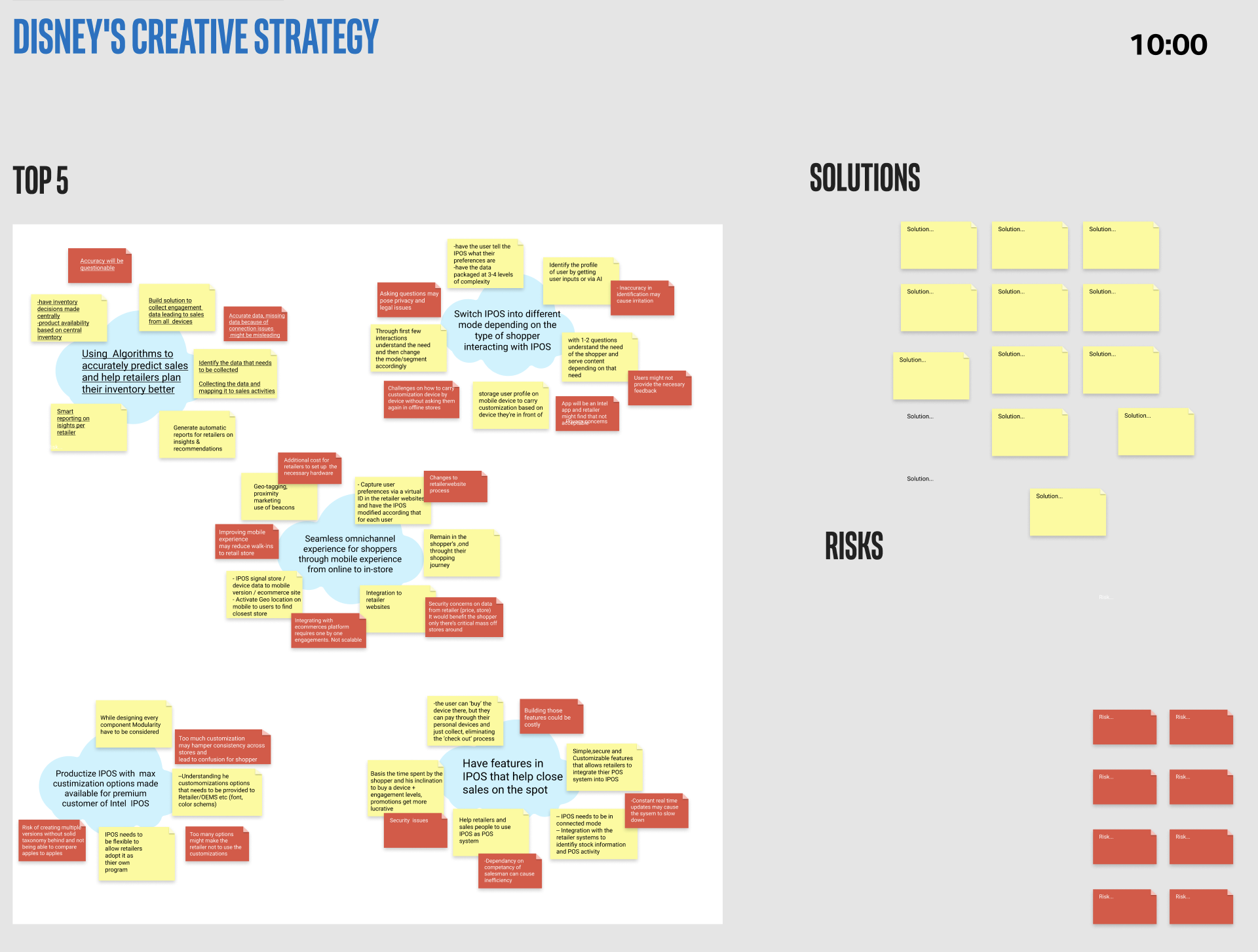
For this portion of the project, I sat in all of the workshops and helped compile insights as they were made and was responsible for background tasks such as starting the timer and helping participants with Figma. The compiled key points were then made into a slide deck by me and one other designer for the client. The slides are below.
Persona & Customer Journey
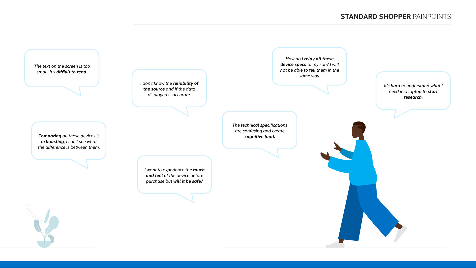
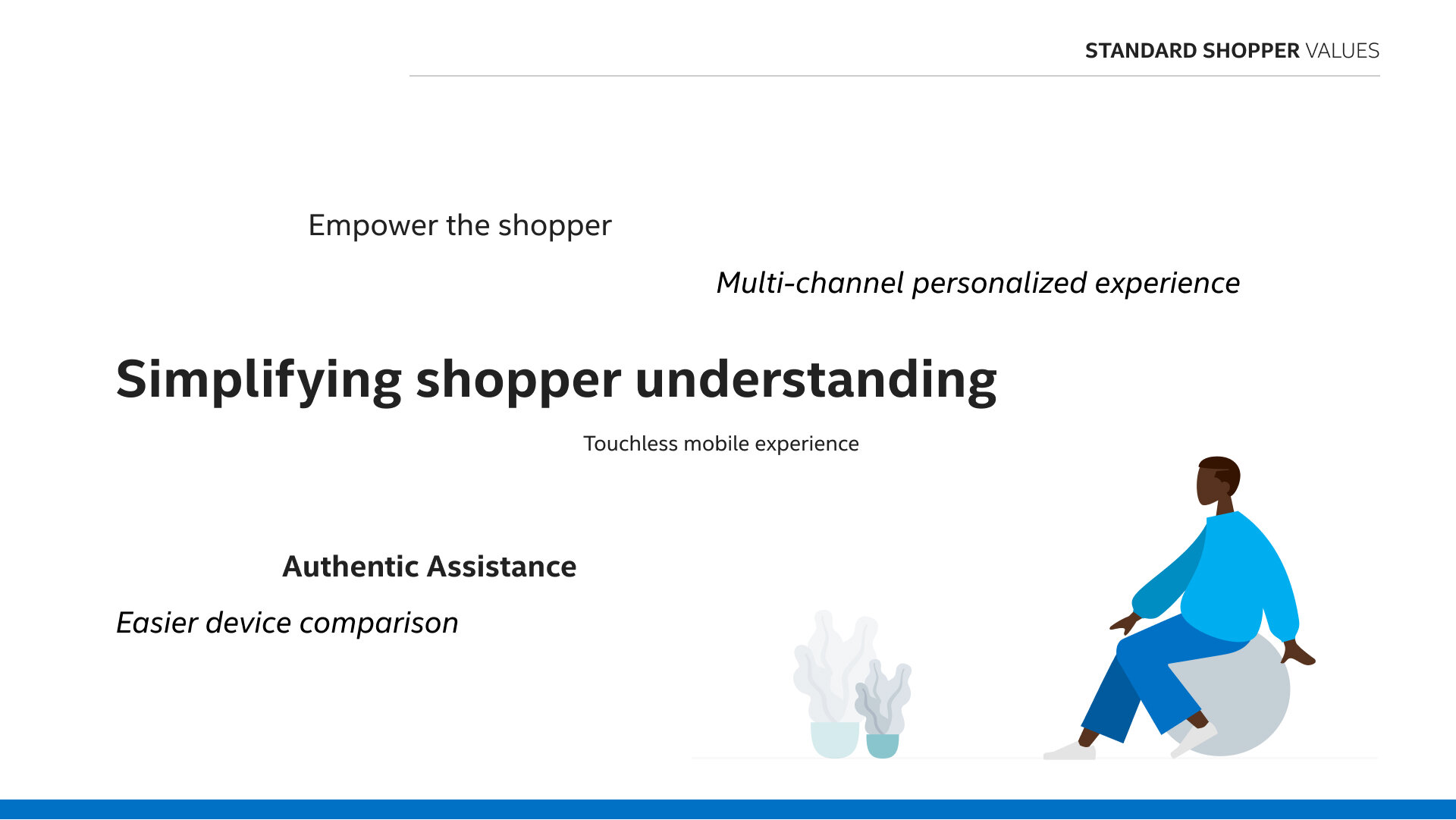
Once we had an understanding of the product and its needs, we moved on to creating personas for the different types of users. Listed below is the persona for my portion of the project. We also created an empathy map and a customer journey for each. There were 6 personas total, I mainly worked on this one.
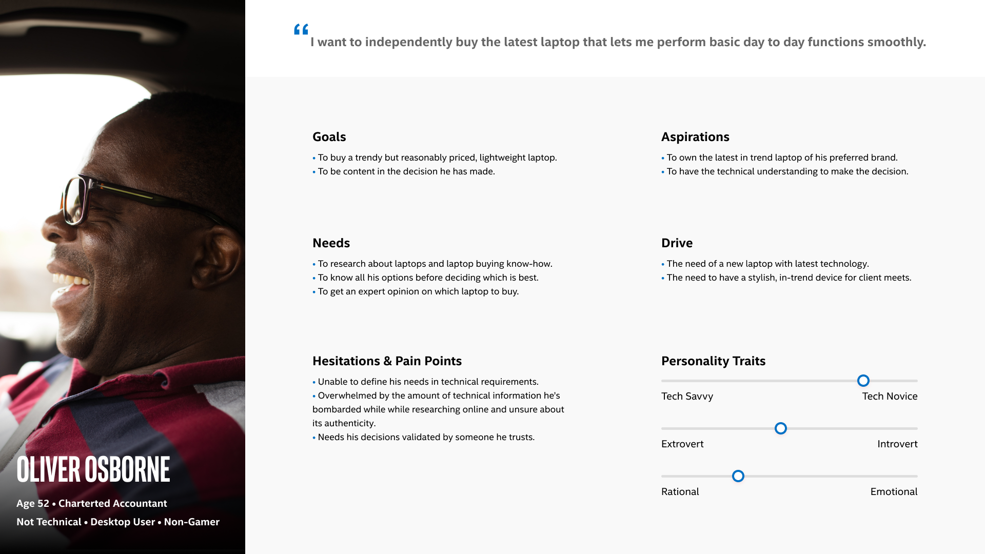
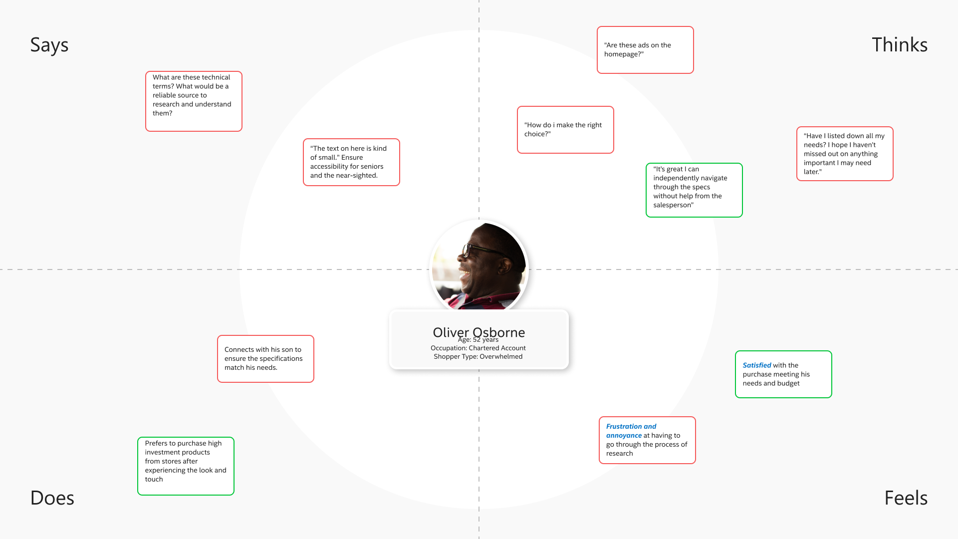
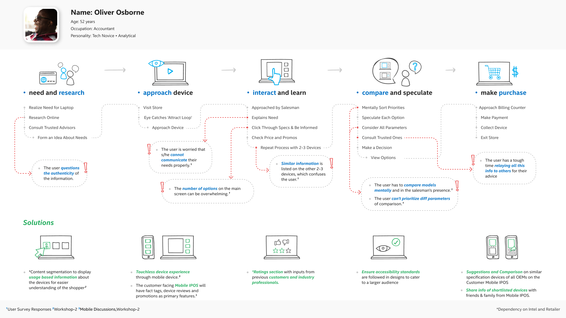
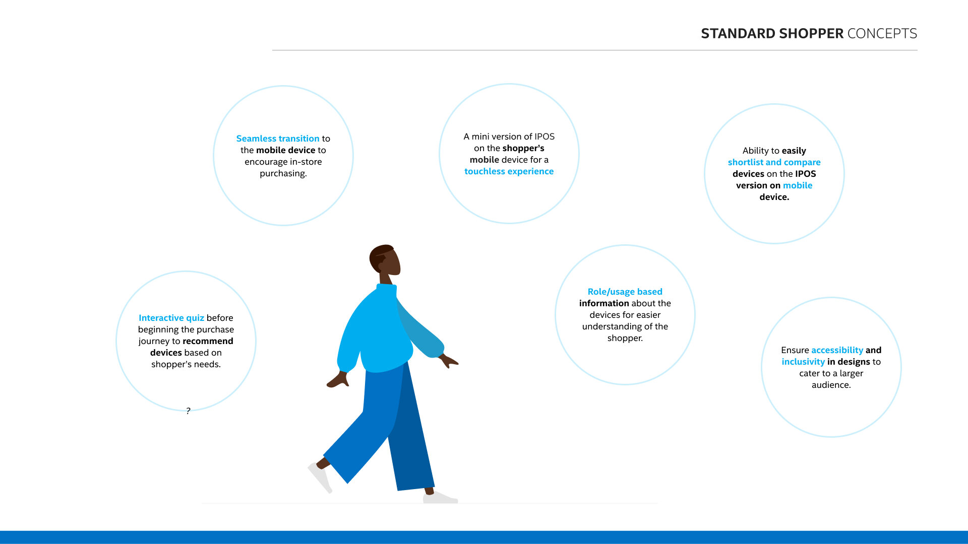
The persona, empathy map, and customer journey gave us even more insight into the Standard Shopper persona’s painpoints. We were then able to formulate possible solutions.
Workflows
We then created workflows to visualize the overall structure of the software and to help us ideate for the low fidelity wireframes. 11 workflows were created but I mainly focused on the below 2.
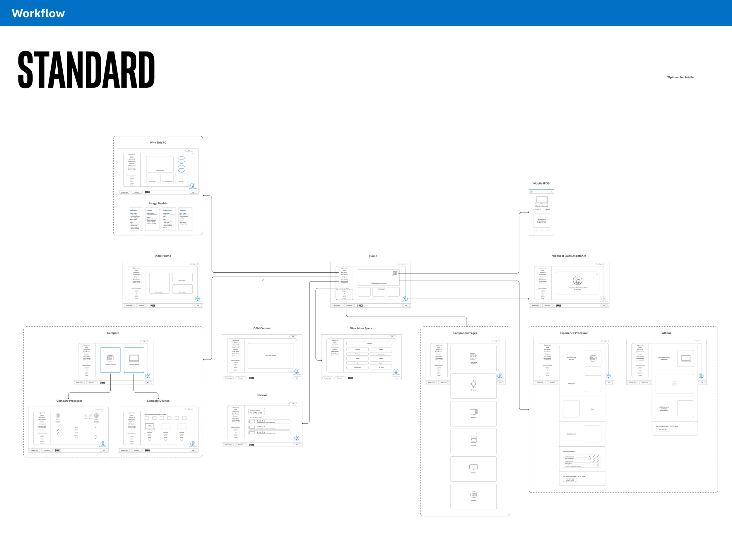
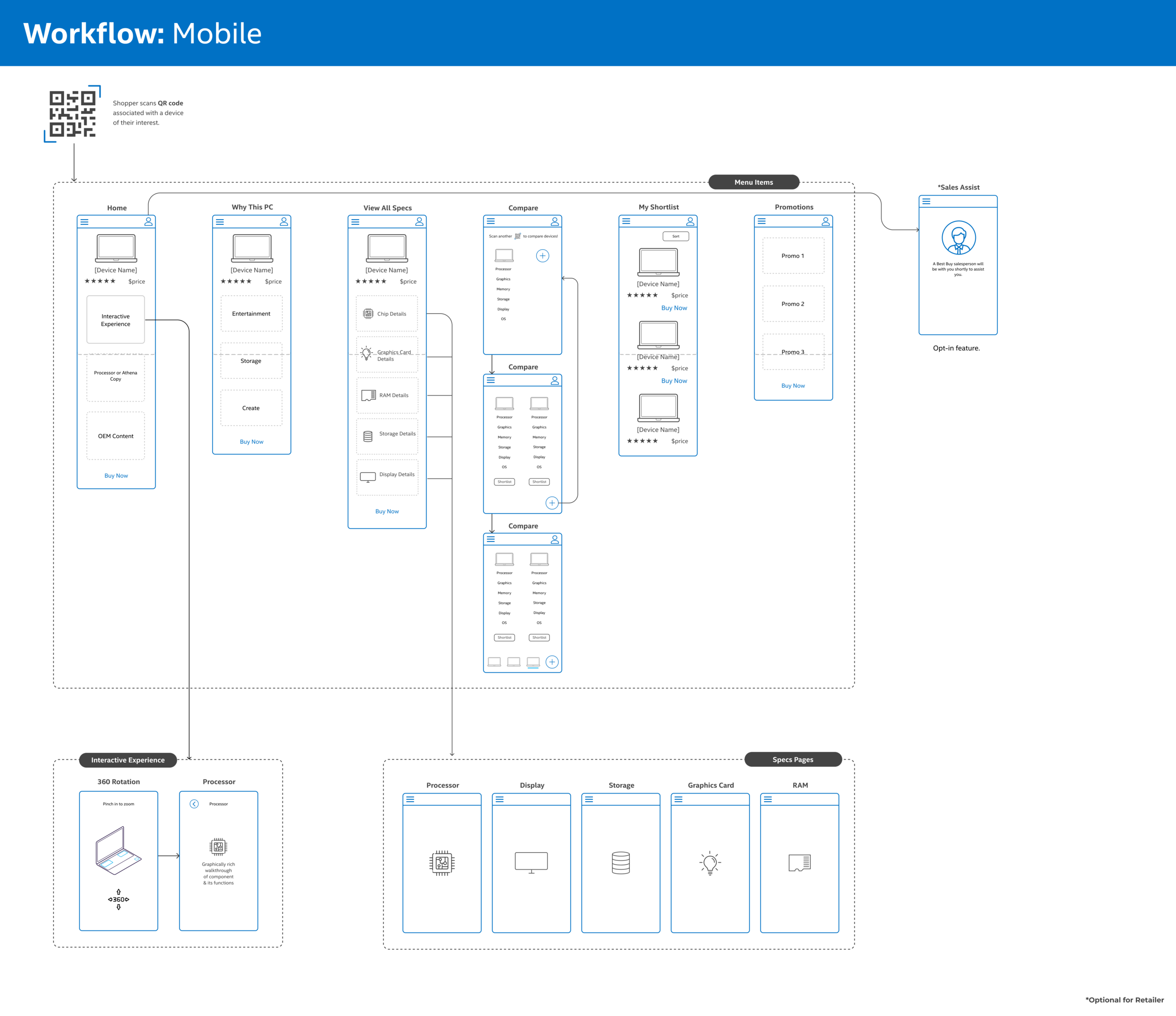
Click here to see the workflows in detail.
Low Fidelity Wireframes
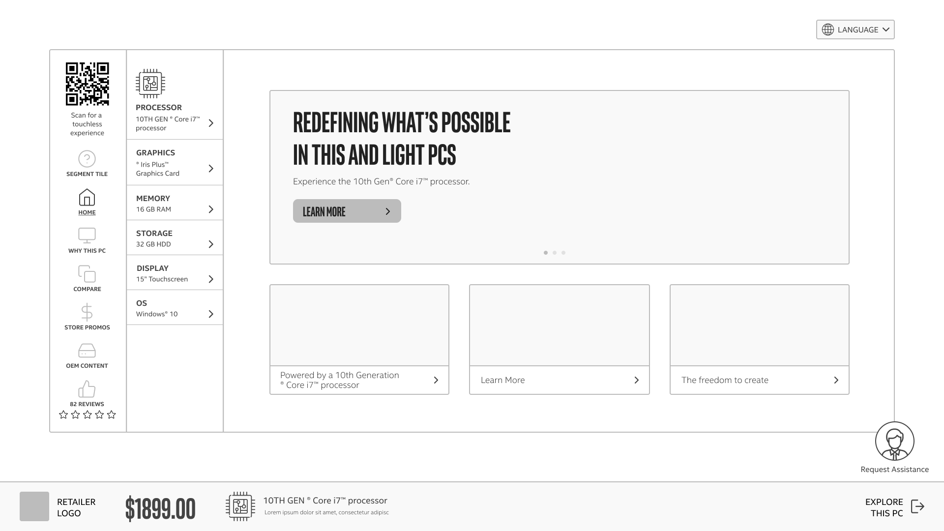
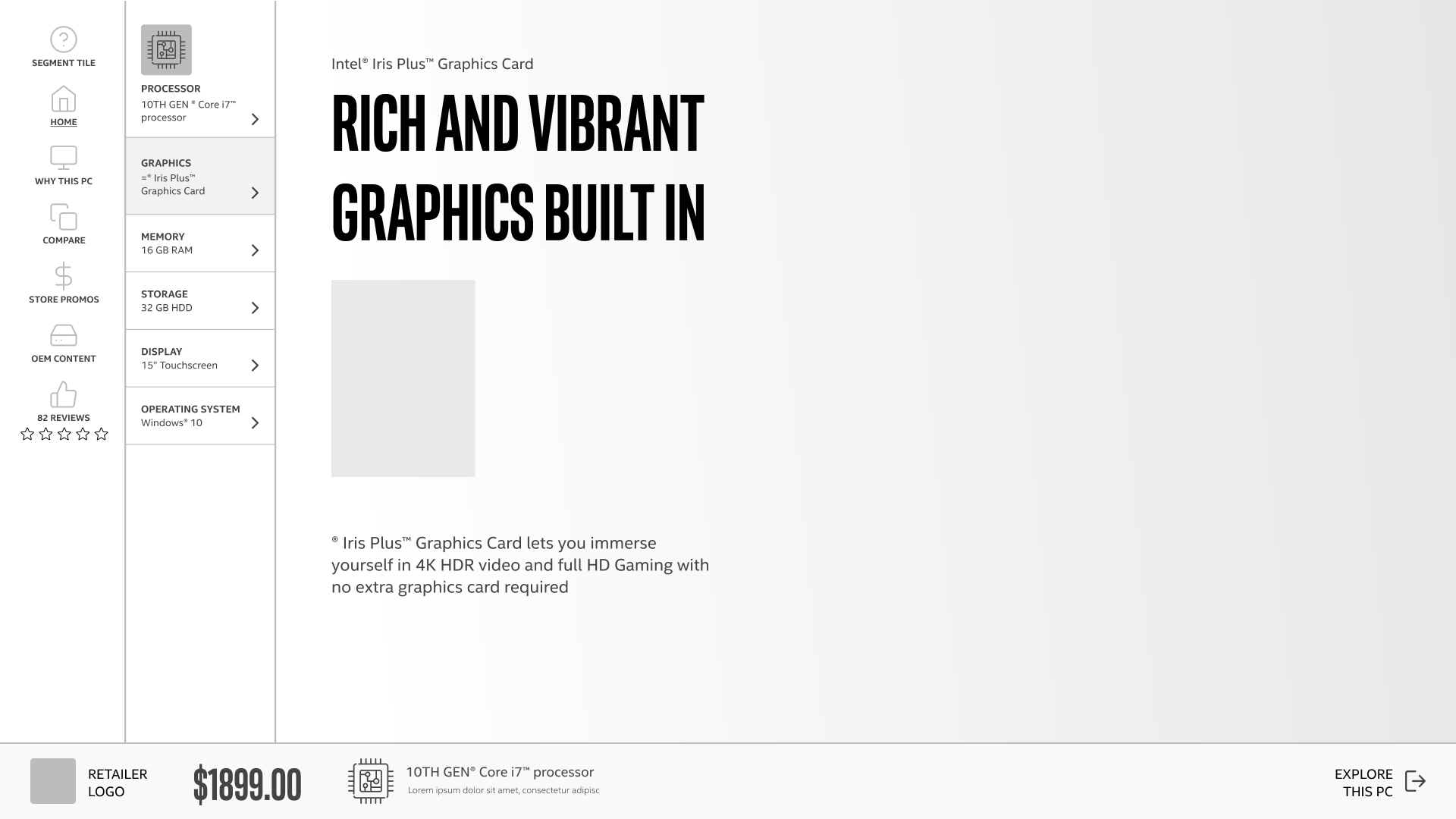
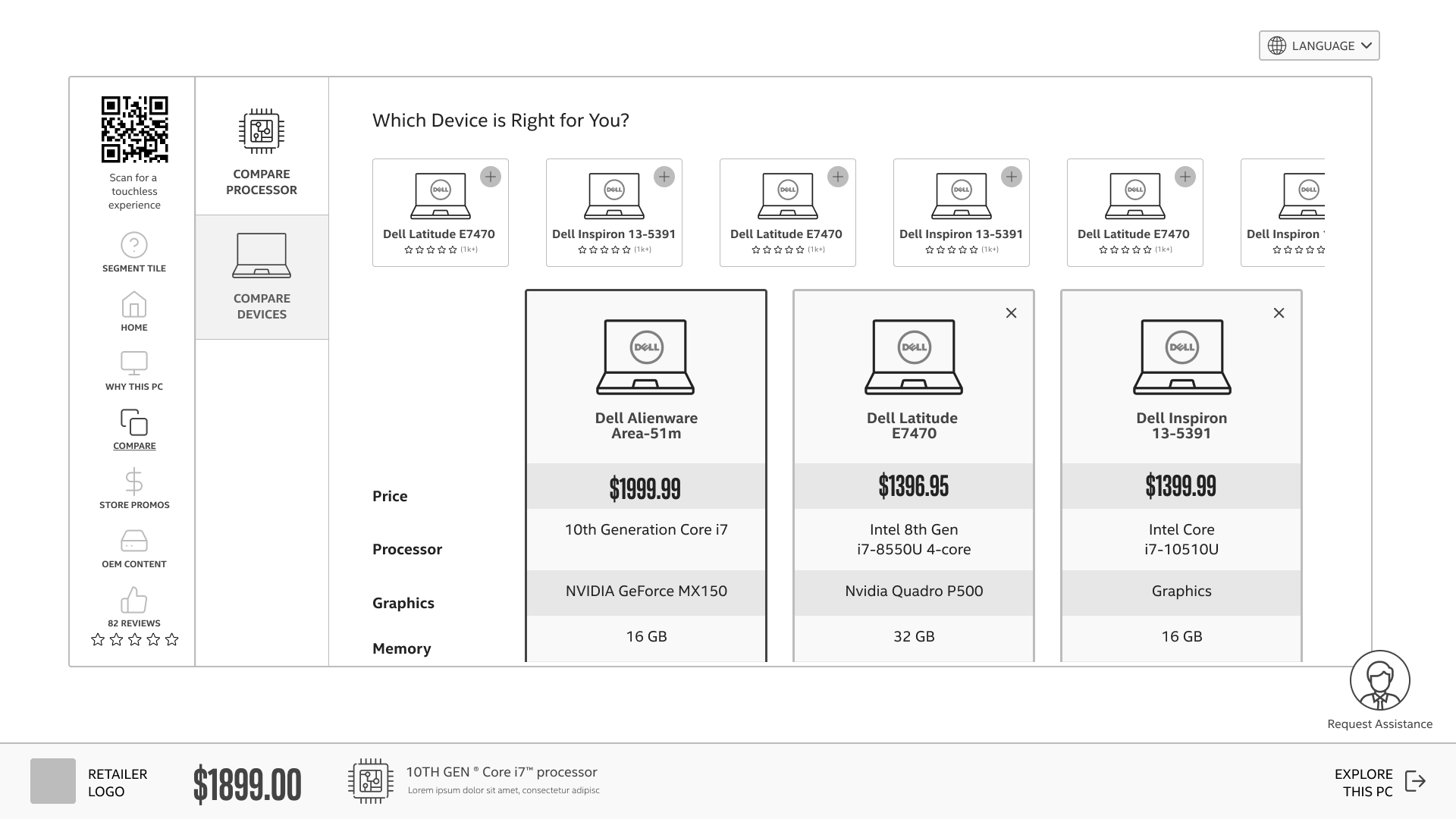
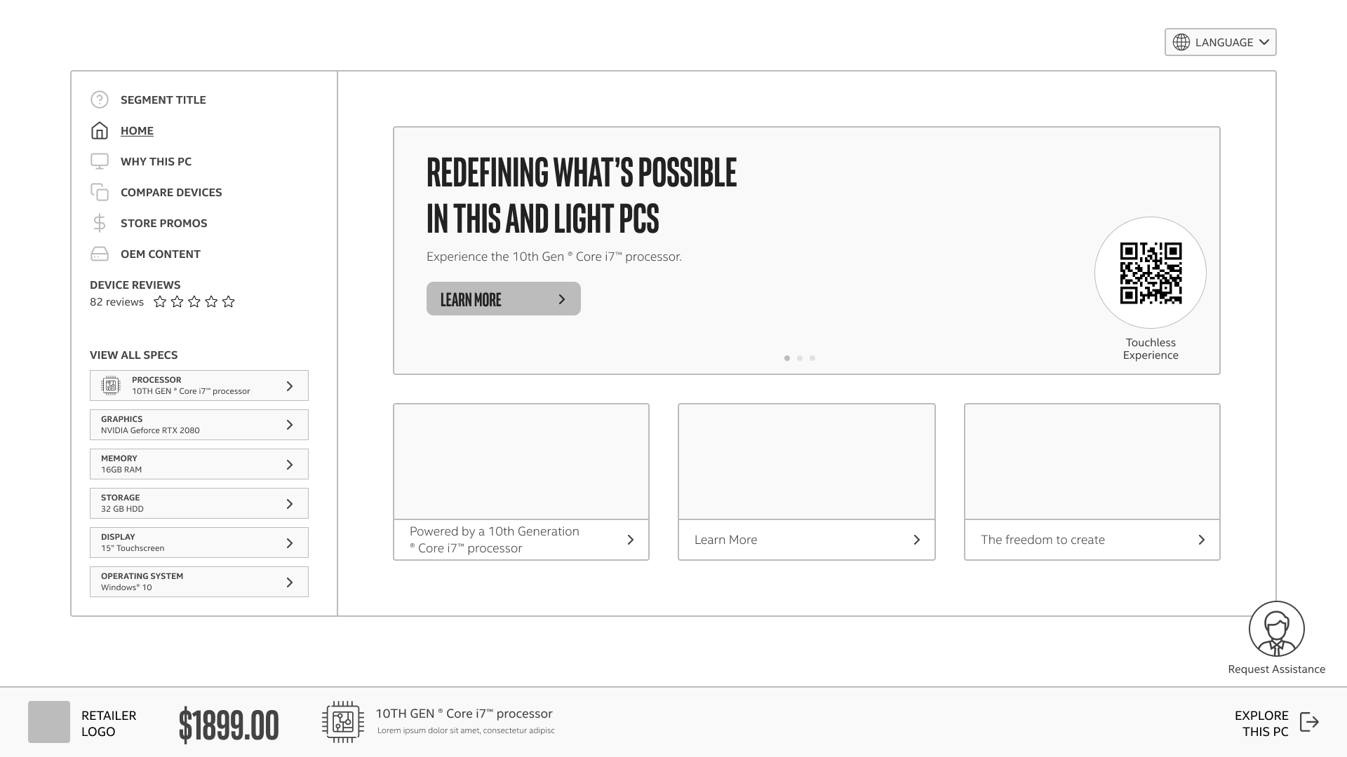
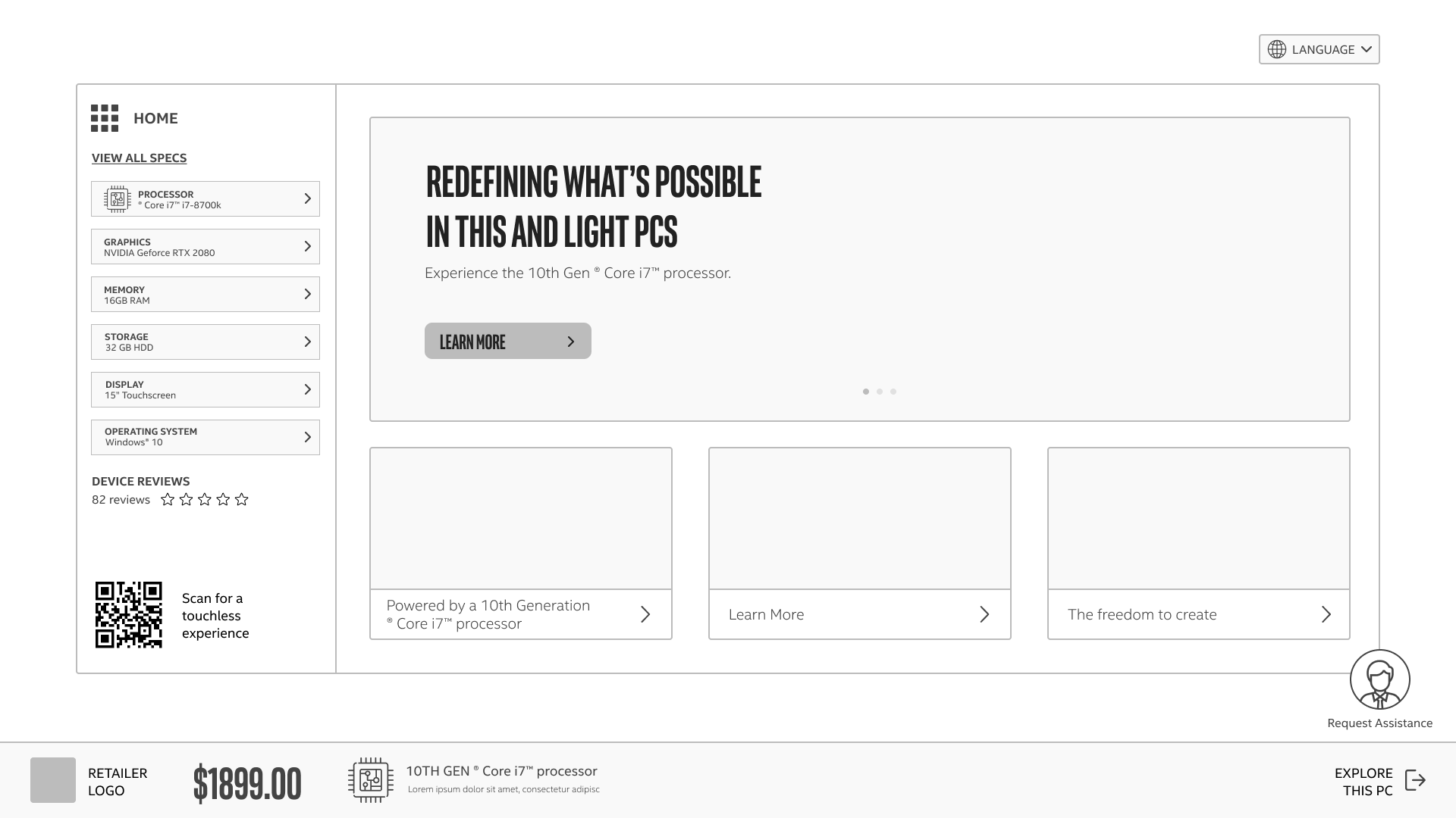
Creating the wireframes was definitely not a straight forward process. There were many stand-ups and client meetings in-between where adjustments were made. Below are a few examples of the versions of homepages we created to show the clients before we decided on the final one shown above.
Inspiration Boards
We created inspiration boards to understand the look and feel of the UI for the high fidelity wireframes. I created the one below, there were 4 created in total (Standard, Gaming, Chrome OS, and Central - the admin portal)
Challenges & Future Considerations
The research was very, very rushed and the client didn’t give us a budget for it at all. We had to do guerilla research which I felt wasn’t enough for this size of a project, especially for a company as well known as this one. However, I do feel like the stakeholder workshops made up for some of it since we got the chance to speak to salespeople and the managers in charge of the software in detail.
It was hard to apply the user research to our designs since the entire project was so rushed. I remedied this by spending more time looking through the current software and the stakeholder interview insights so I could understand it thoroughly and translate them into my designs.
We were definitely short staffed, so many more artifacts were produced than actually shown on this page and we had to adapt to work under strict deadlines and an unusual amount of ambiguity about requirements. However, this was a good learning opportunity as many UX projects are about gaining clarity through ambiguity.
Half the UX team and all of the developers were located in India, so we had to really be great about communicating what needed to be done. If there was any miscommunication, a whole day could be wasted completing a task the wrong way.
I was only brought on for the “Discovery” (research) phase of the project, it would have been enjoyable to see the project come into fruition the full way and participate in all phases of the UX process.
A lot of usability testing will be required for the COVID part of the project, judging by the research budget this may not be feasible for this product.


