Banana App: Mobile App
Designing for a Nonprofit
Scope:
I serve as the program coordinator and UX lead for Banana App. There are 2 versions of the app. One for the client (low income families, the homeless, etc) and one for the donor (restaurants, local grocery owners). I designed the client app. Both are ongoing projects that have been evolving since November 2019.
Methodologies & Deliverables:
Background & Market research, stakeholder interviews, persona, user journey, and Figma prototype.
Problem:
We wanted to solve the problem of connecting food donors with low income families and the homeless. Since the apps are new and planned to launch later this year, our main goal is to develop trust with our users to increase downloads and boost app usage.
Solution:
2 user friendly applications that are designed with simplicity in mind and heavy consideration into making development as swift as possible that successfully facilitates food donations and develops trust with its users.
Client & Goals
The Banana App is a tech initiative of the Be Good Project in an effort to help alleviate poverty by preventing unintentional hunger and reducing food wastage. The United States wastes 150,000 tons of food each day – equal to a pound per person. Up to 40 percent of the food in the United States is never eaten. At the same time, one in eight Americans struggle to put enough food on the table (NRDC). In 2015, according to the USDA, Americas threw away 133 billion pounds of food worth $161 billion, which equates almost 220 lbs per person. Wasted food is the single largest category of material placed in municipal landfills and represents nourishment that could have helped feed families in need.
Our mobile-based project "The Banana App" will provide grocery stores, restaurants, and the like a time-sensitive platform to donate unwanted produce or food. Verified no-to-low-income clients or homeless individuals will be able to register using our app. Upon completion and approval of the application, user can accept and pickup these donations.
The Process
Banana App’s process was a little unconventional. The project started off with another volunteer UX designer who had to leave the project due to other obligations. The designer who worked on the donor app and I joined after she had already started making a prototype. Very little user research was done before the prototype was started since there was such a push to get the product to launch. Research is currently ongoing. I am also continuously making improvements to the prototype as we learn from our research, personas, journey maps, and other artifacts.
Background & Market Research
I went into the project knowing there was a hunger and a homeless problem in Seattle. However, more in-depth user research is needed to obtain both quantitative and qualitative data regarding the issue. There are two parts to the research I’ve currently completed; the stakeholder interviews and a competitive analysis. Both parts were done retroactively after the prototype was made.
The competitive analysis helped to define what other organizations were doing that were working and not working. From this we gathered features we will consider adding to later versions of Banana App. This includes the ability for in-app communication between donor and client, and opening up donors to be individuals instead of just businesses.
Stakeholder Interviews:
I conducted interviews with the project owner and executive team to get clear ideas of expectations, logistics, and requirements for both donors and clients. Key takeaways are listed below.
Each client is limited to one serving per food claim. The serving is determined by the donor. For example, if the food is bananas, a serving can be 1 bunch. If more than 1 serving is desired, the client can make multiple claims of the same food.
All registrations will be manually approved by an admin member to ensure safety. Donors will be required to provide a business license and clients will be required to provide proof that they are low income. The pick up instructions that the clients receive will be provided by the donor upon registration. An admin member or other Banana App personnel will need to visit each business to make sure the instructions are clear and to make sure the space is safe for clients to pick up food.
Both apps will need to be as simple as possible but still cater to all types of clients. Considerations include low income families, the homeless, clients with limited modes of transportation, clients who aren’t great at technology, or clients who need directions getting to the donor site.
Prototyping
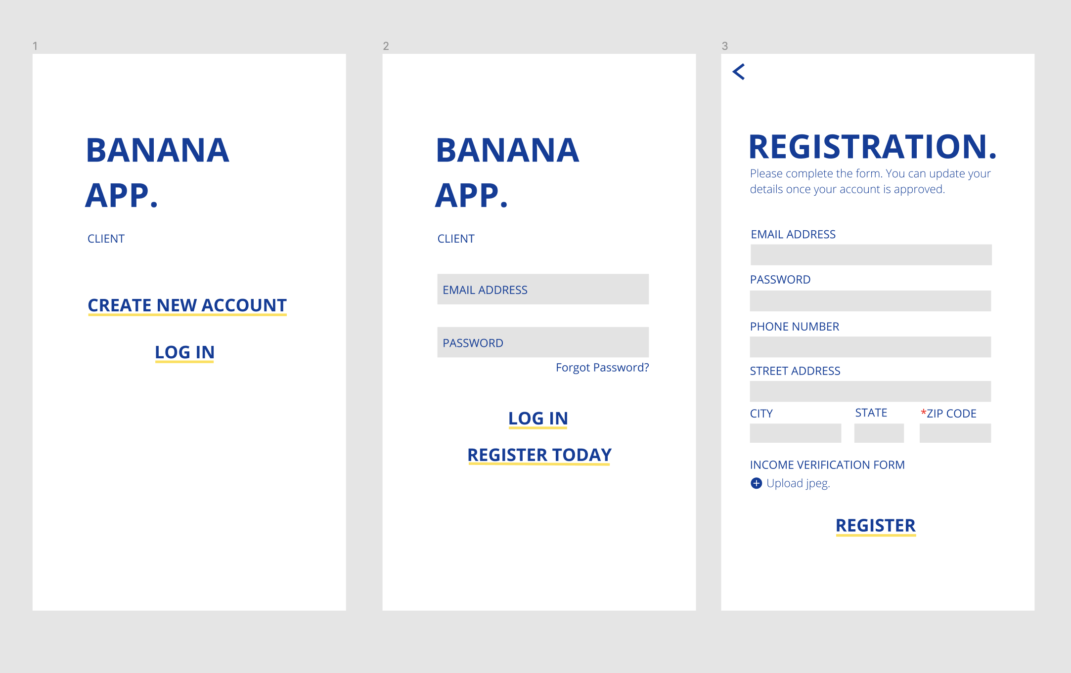
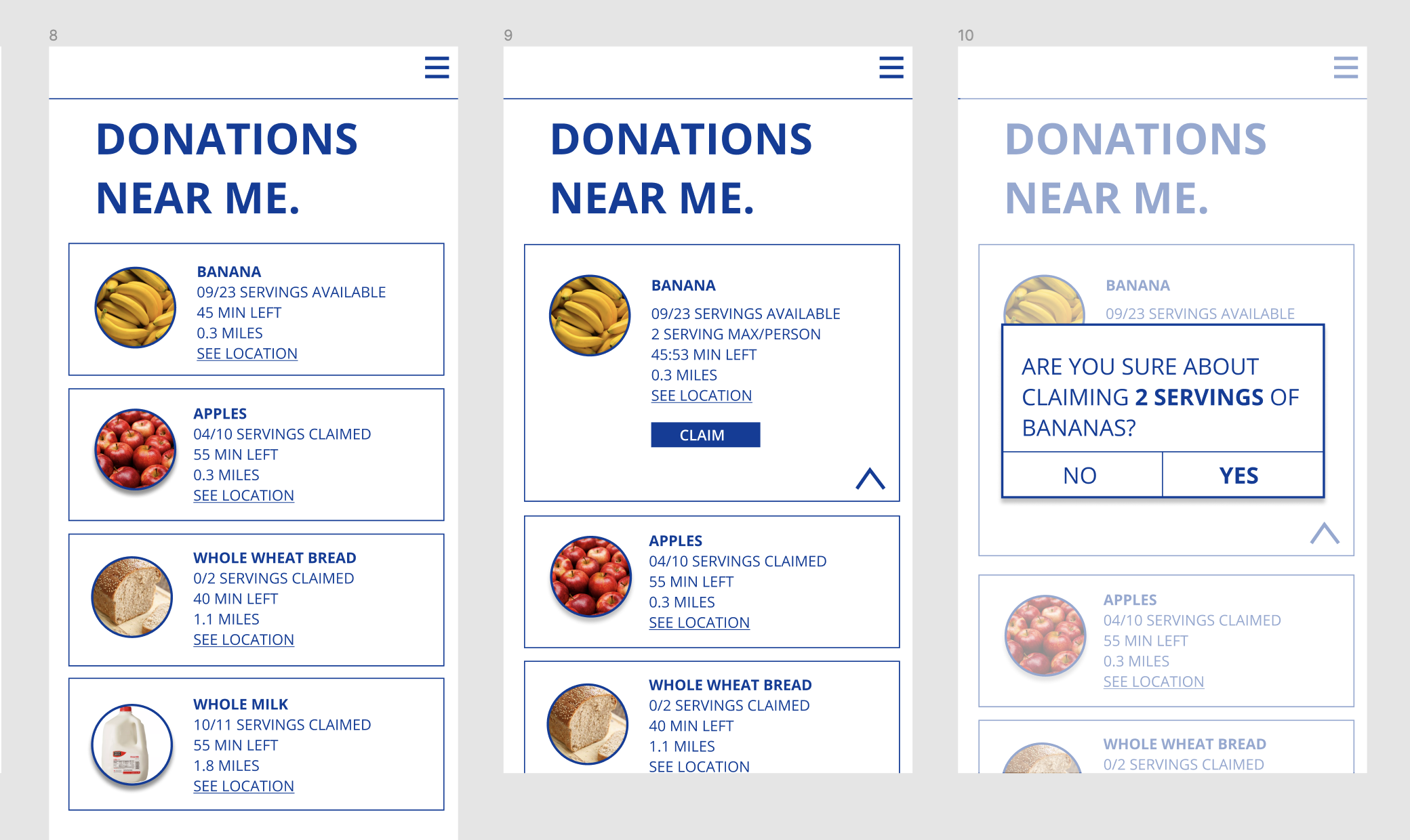
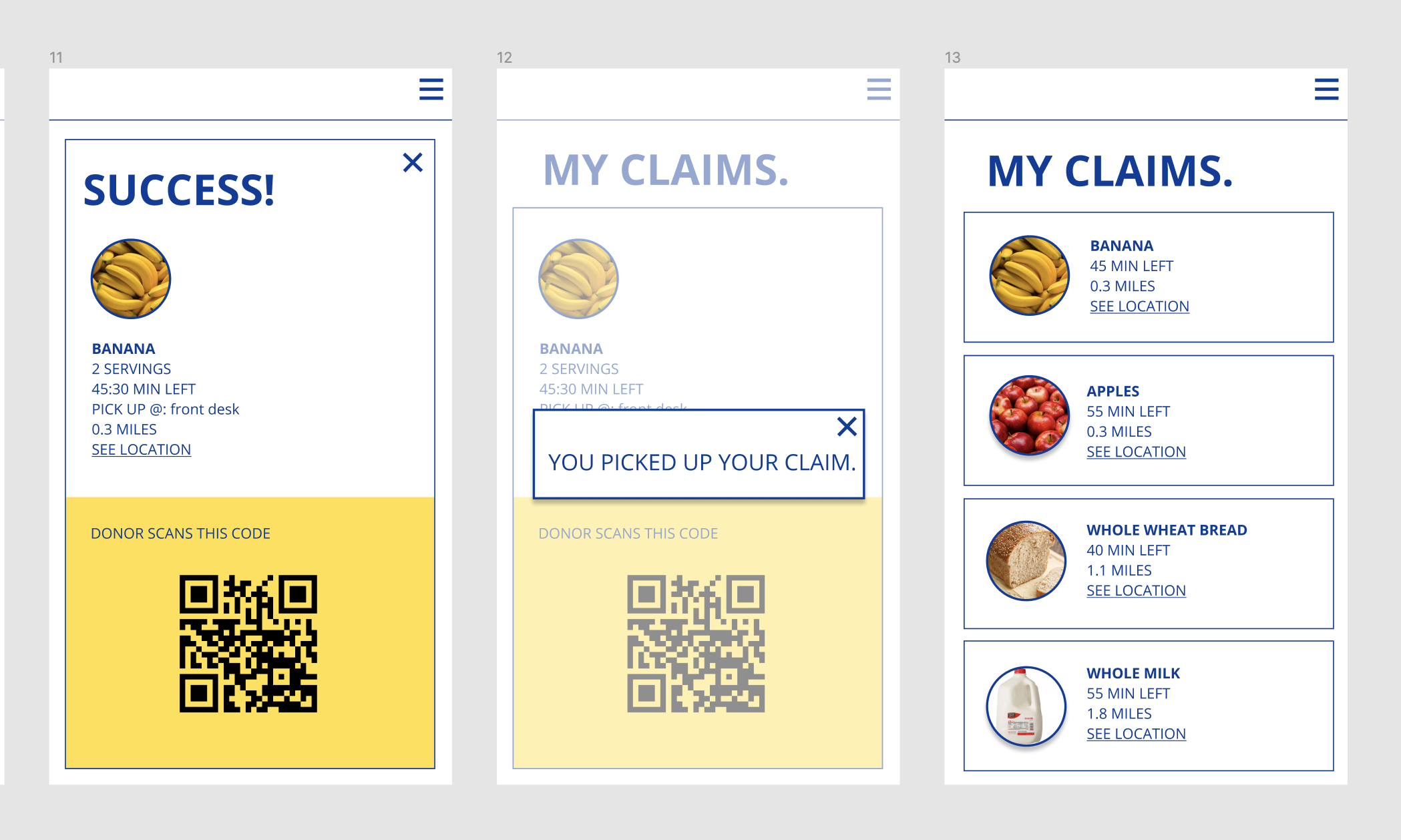
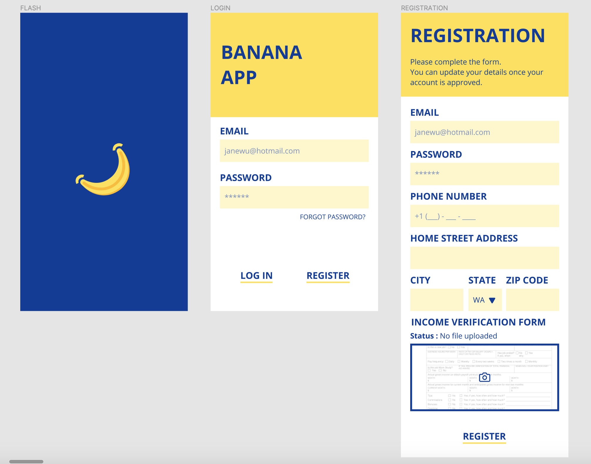
As previously mentioned, the UX designer who joined the organization before me started the prototype. Although not all the screens were completed, the previous designer’s prototype served as a basic wireframe for me. There were no actual wireframes made for the project. All the original screens and my corresponding screens are below for comparison.
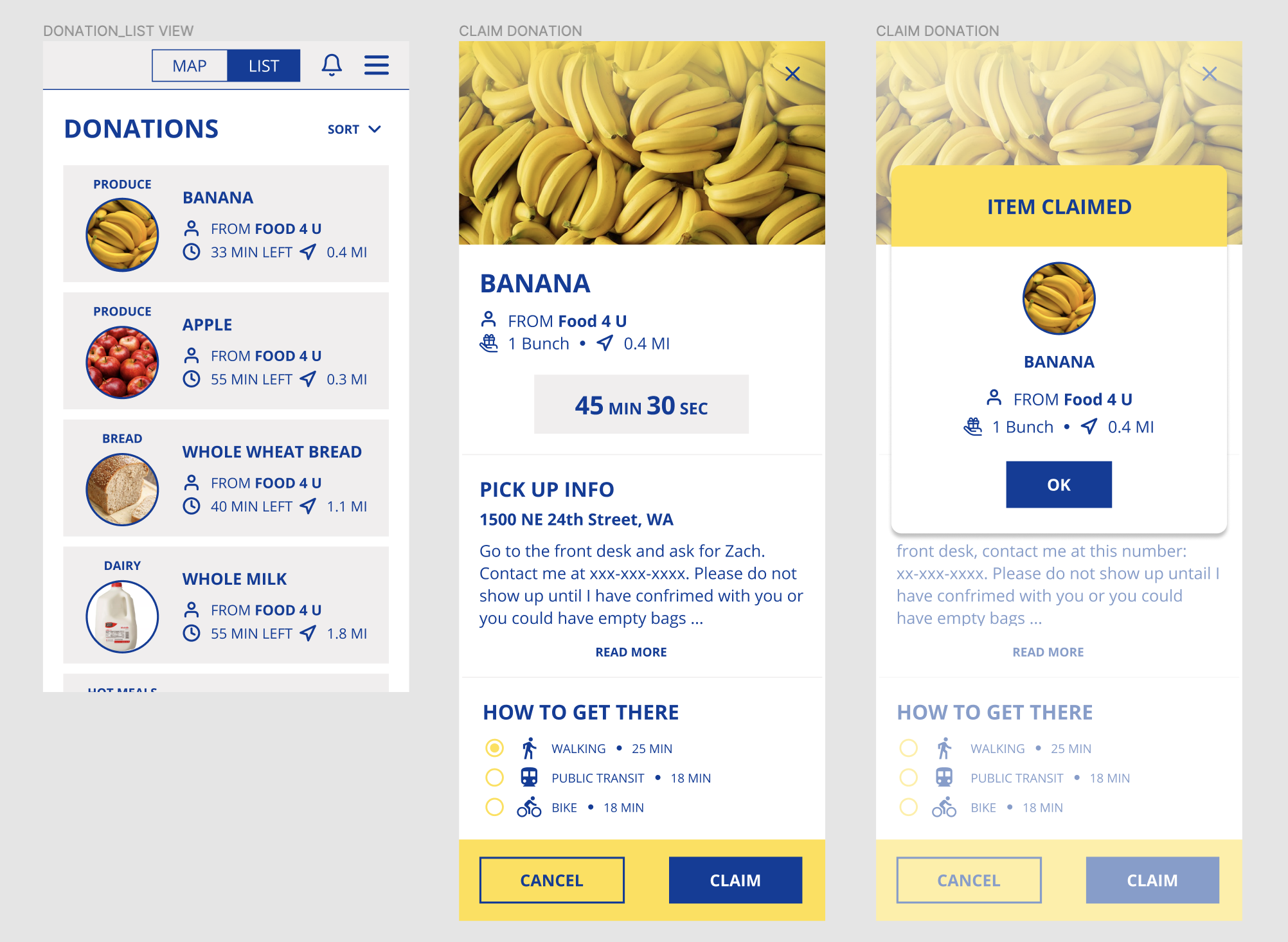
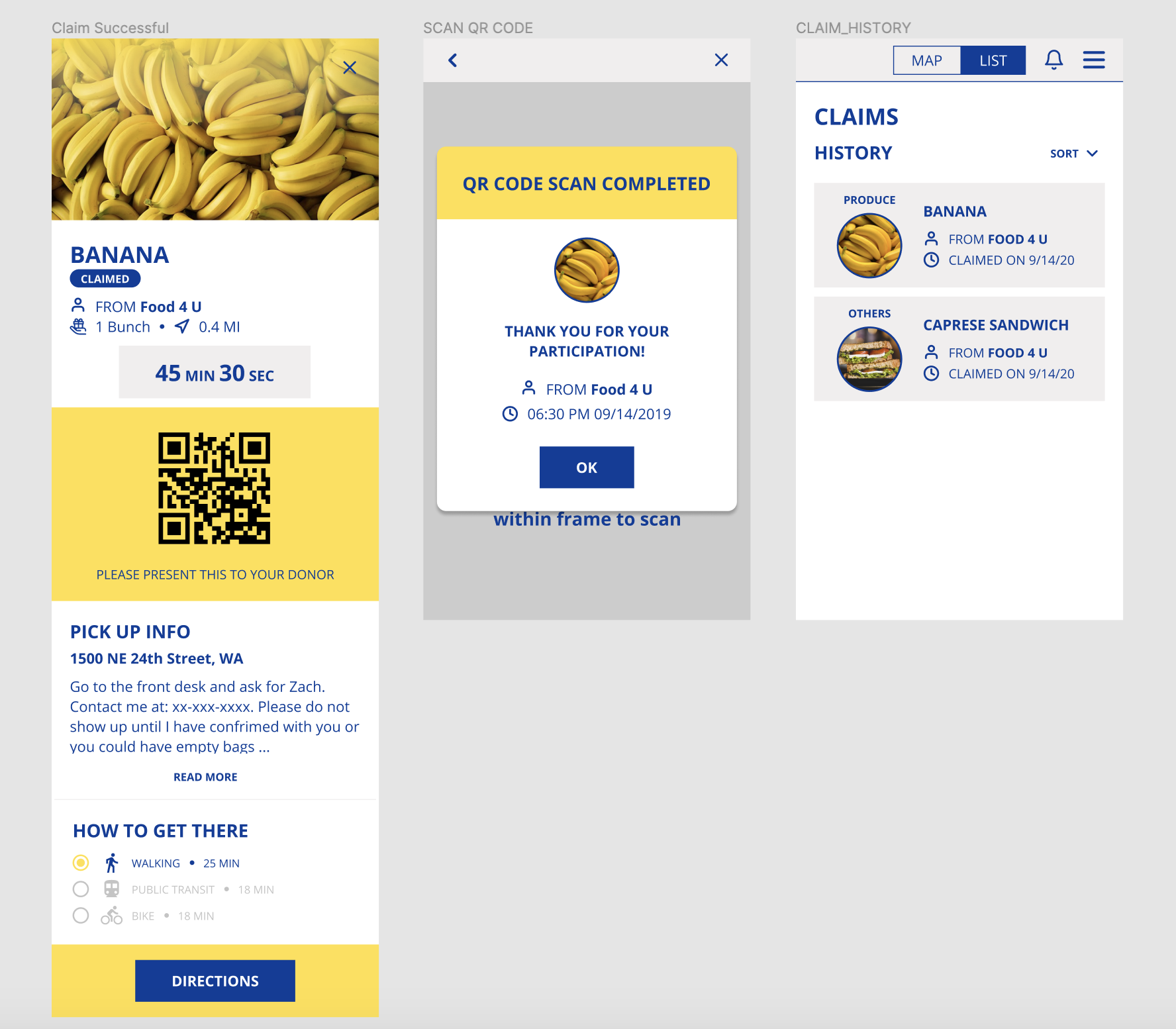
Persona & User Journey Map
Even though I only designed the client app, I created the personas for both the client and donor. Both are loosely based on our background and market research.
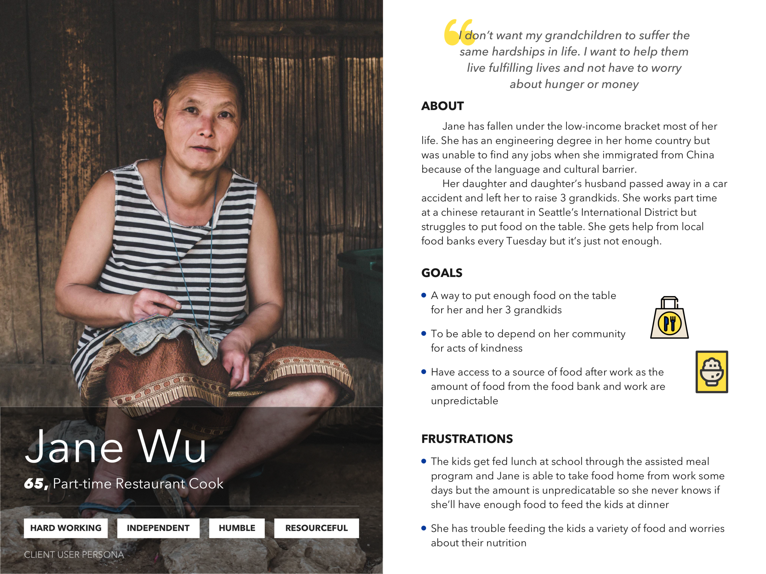
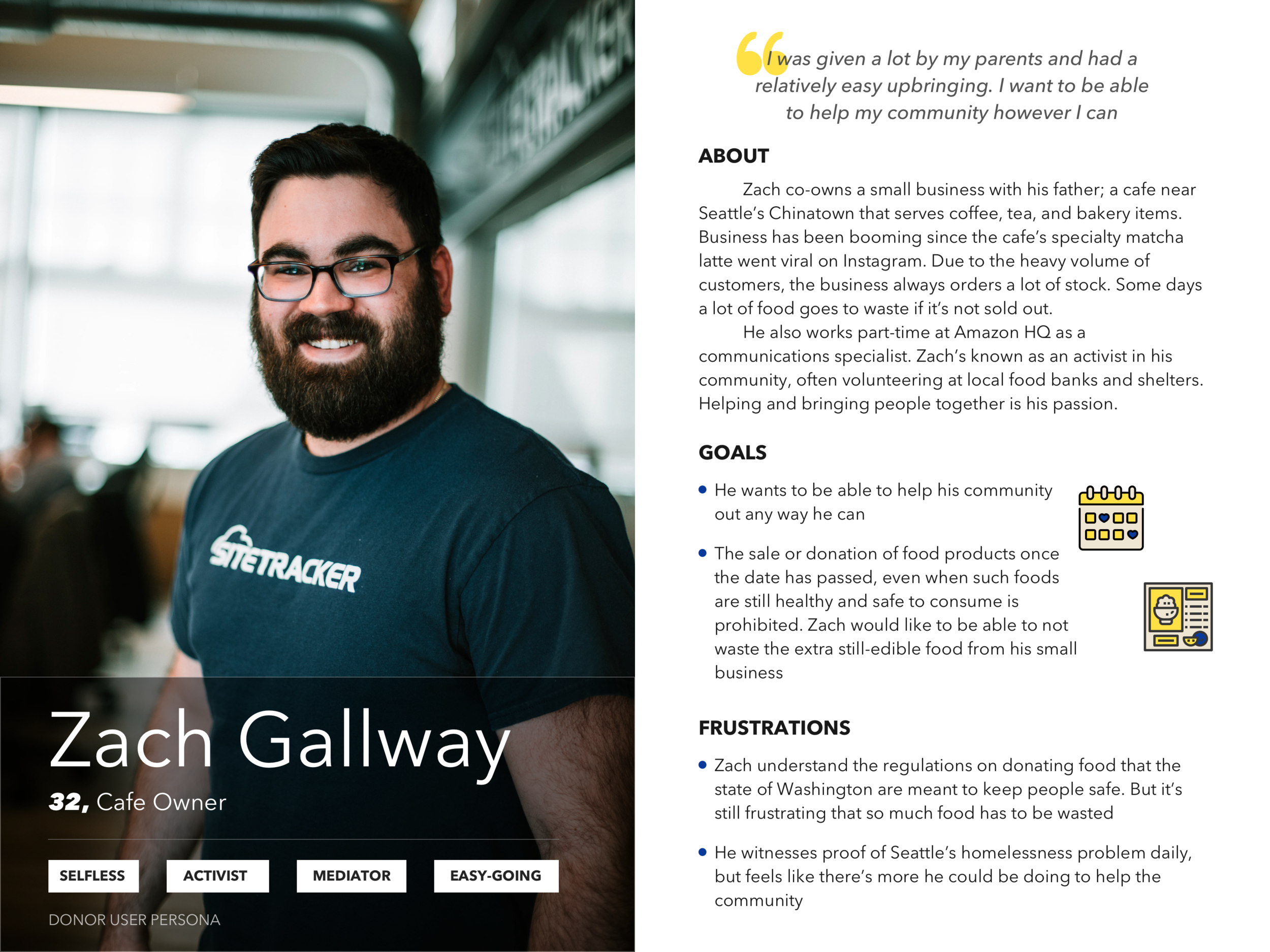
According to Census data from 2019, the poverty rate in Seattle is 11 percent - about one in nine residents live in poverty. A significant percentage of poverty comes from the International District/Chinatown, Downtown Seattle, and Rainier Vista. Communities that struggle with poverty have the most difficulty meeting their basic needs, like having food, especially during times of crisis like COVID-19 (Source). A lot of the research that went into making the personas came from local news websites and Facebook groups like Support the ID - Community United; created to help out Seattle’s International District during times of crisis, and a place for local families to share their stories.
Challenges & Future Considerations
As this is an ongoing project, the prototype is constantly changing and we’re trying to prioritize features for the MVP. Not every project has a perfect UX process. In the case of Banana App, the process was backwards; the prototype was designed before enough research was done. As we worked on the design, we also had to mitigate the issue of members joining and leaving the organization as it’s built on volunteers. The top 3 areas of concern include:
User research has been pushed back due to COVID-19. The plan was to do a round of surveys before conducting face to face interviews with business owners in Seattle’s Chinatown area to gain a better idea of our user’s needs and frustrations. It has been a challenge to preach the importance of research to the stakeholders and confirmation that stakeholder assumptions’ about user needs are correct is needed. This is also important since the structure of restaurants (our main donor base) may change due to COVID-19. A whole new set of needs and frustrations could arise in the coming months and we need to be agile and adapt our app appropriately.
Legal research is also needed. Since we are working with food there are a lot of liability and insurance issues the team needs to work through. We are currently trying to recruit volunteers with project management experience to map out how to go about this.
Usability testing is vital to any UX project. I would like to do 2 rounds of testing on at least 5 users before launch.


